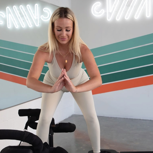
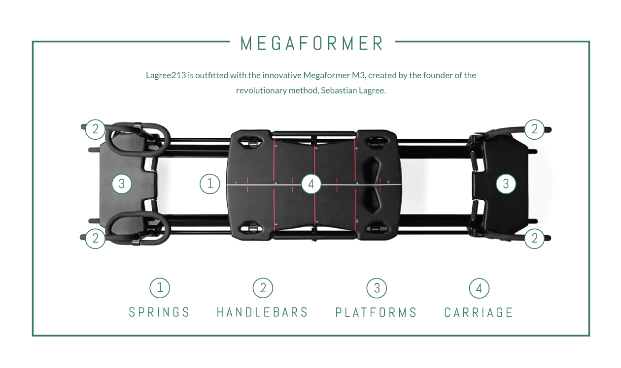
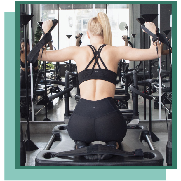
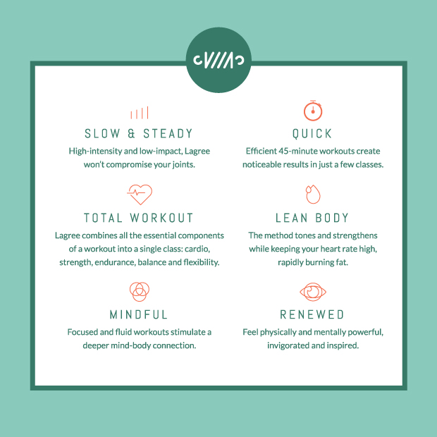
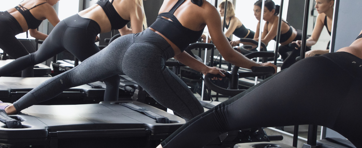
Lagree 213 grew out of a Downtown Los Angeles studio that had been teaching since 2008 under the name Pilates Plus DTLA. When the owners decided to relaunch it as a Lagree studio, they had a high-energy, low-impact 45-minute workout, a team of trainers who value connection with their clients, and a new name that had to explain all of it at once.
Fitness studios are easy to scroll past in a city full of them, and the risk was a brand that looked like every other boutique class without carrying the warmth and humor of the room itself. The owners wanted people to feel the upbeat, positive atmosphere before they ever stepped onto a megaformer, whether they met it on a sign, a flyer, or a booking page.
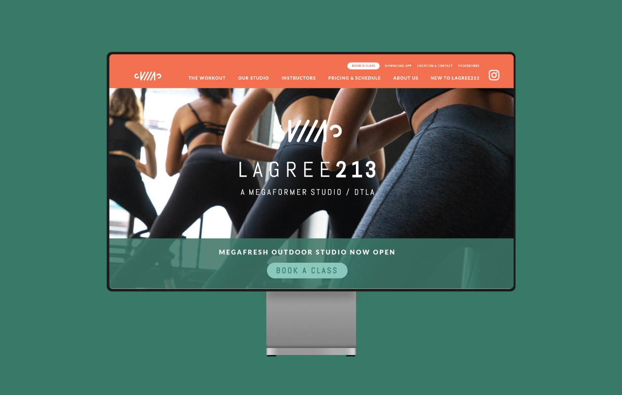
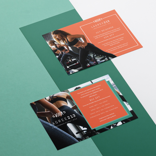
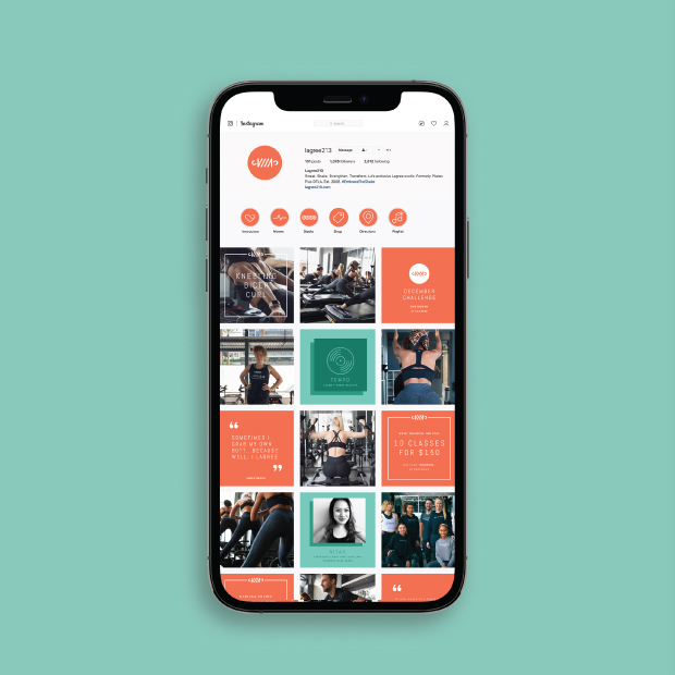
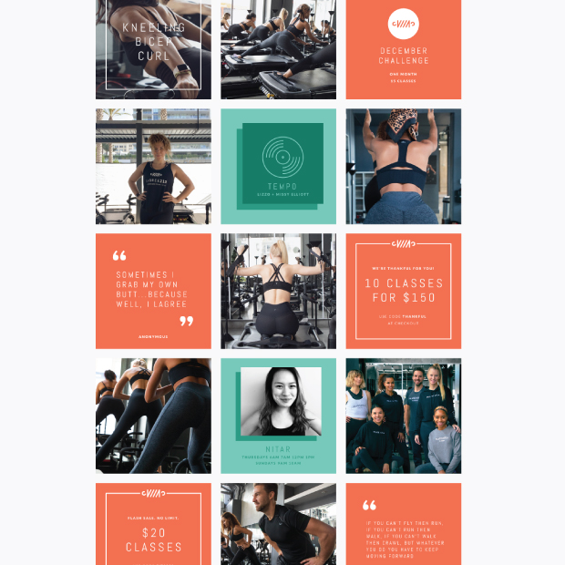
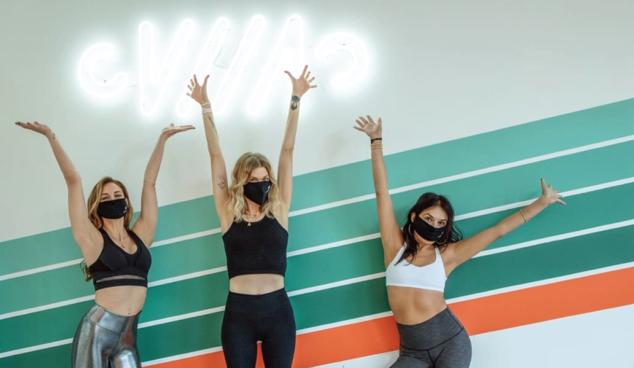
We began with the language. The tagline Embrace The Shake gave clients a phrase they could say out loud, the clarifier A Megaformer Studio DTLA told newcomers exactly what the studio is, and the positioning statement moved through the method in the same rhythm as the class, from sweat to shake to strength to transformation. From there we designed the visual identity and built the website, then carried the brand into signage, interior branding, direct mail, social media design, and email marketing so the studio looked and sounded the same on the street, in the room, and in the inbox. As the studio added classes and a new location, we returned to the site to bring them in.
Today lagree213.com lets visitors browse classes across the Historic Core, Arts District, and South Park studios, book online, and find new member specials, class packages, and gift cards in one place. The studio has a brand that sounds as energetic as its classes and a website where the connection its trainers care about is present from the first click.