Brand & Website Design for an Eating Disorder Treatment Practice

Prelude

Prelude is an eating disorder treatment and recovery community in Corvallis, Oregon, serving adults, adolescents, and families with an evidence-based, trauma-informed, anti-oppression approach that includes therapy, nutrition guidance, and groups.

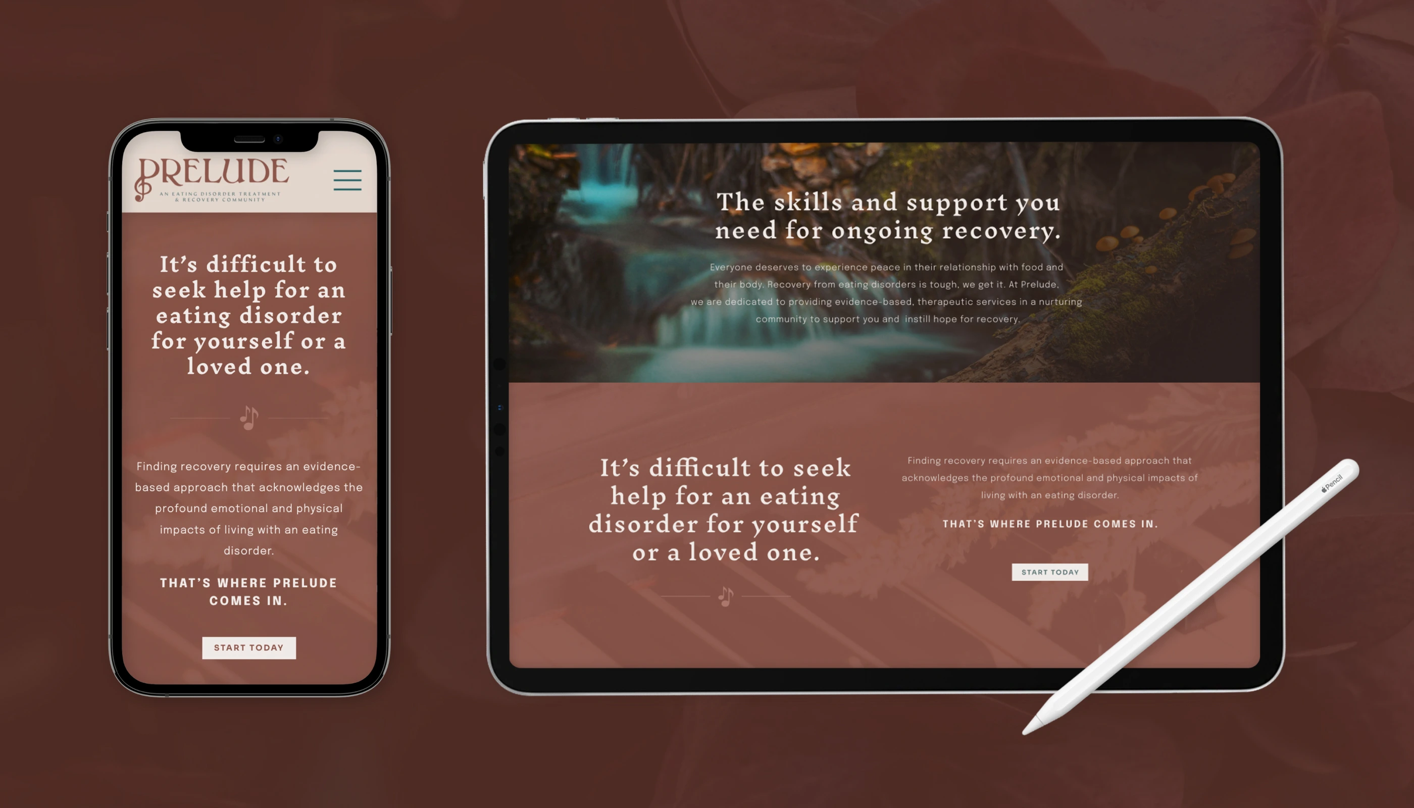
Prelude came to DesignGood to talk about eating disorder care in a way that is clear to families and credible to the professionals who refer to them. We built their brand language and positioning, visual identity, copywriting, and website around a warm, judgment-free voice and a clinical foundation, and gave the community its line, Support. Healing. Hope.

It is brand and website design for eating disorder and mental health treatment programs, with room for resources, programs, and the people who deliver them, so a family or a referring provider can find what they need quickly.

Our Contributions

Brand Language & Positioning, Visual Identity, Copywriting, Website Design

No items found.

Who This Brand Was Built For

We build brands for treatment programs and therapists who care for people at a vulnerable moment and need the first page to feel steady. Prelude's brand had to speak to adults, adolescents, and families facing an eating disorder and the stigma and shame that often keep them from asking for help, and to the local professionals who refer clients, so that each of them could trust Prelude before making contact.

What Changed for Prelude

Prelude was built to be a state of the art eating disorder treatment center grounded in current science and of service to its local and statewide community. Its team treats adults, adolescents, and families through a partial hospitalization program that includes therapy, nutrition guidance, body image and movement groups, and ongoing education.

Eating disorders carry stigma and shame, and that makes reaching out hard for the person who needs care and for the parent trying to find it. A website for that audience has to be warm without being vague and clinical without feeling cold, and it has to give referring providers a reason to send people their way.

We started with how Prelude wants people to feel, supported, nourished, and hopeful, and built the brand language from that. The team's own words shaped the clarifier, An Eating Disorder Treatment & Recovery Community, and the line Support. Healing. Hope. The intersectional, anti-oppression, trauma-informed approach was written into the introduction in plain language, and the visual identity, copywriting, and website followed in the same kind, grounded voice.

Deborah Bella of Prelude has shared that the process helped the team clearly articulate how they talk about their business, and that since launch they have received positive feedback from other professionals in the area, especially referring providers. Prelude now has a site that matches the care it offers.

Full Portfolio
Next Project