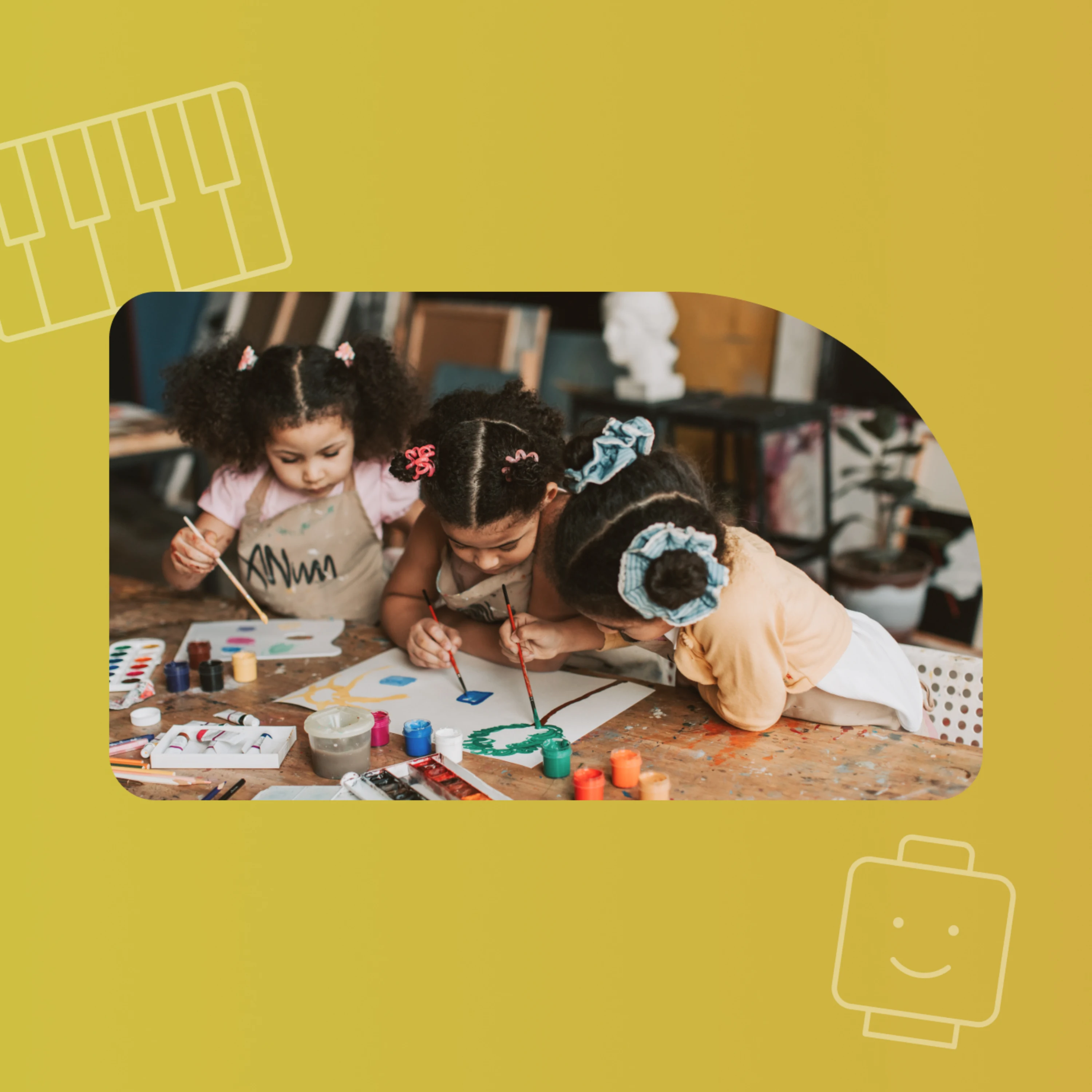
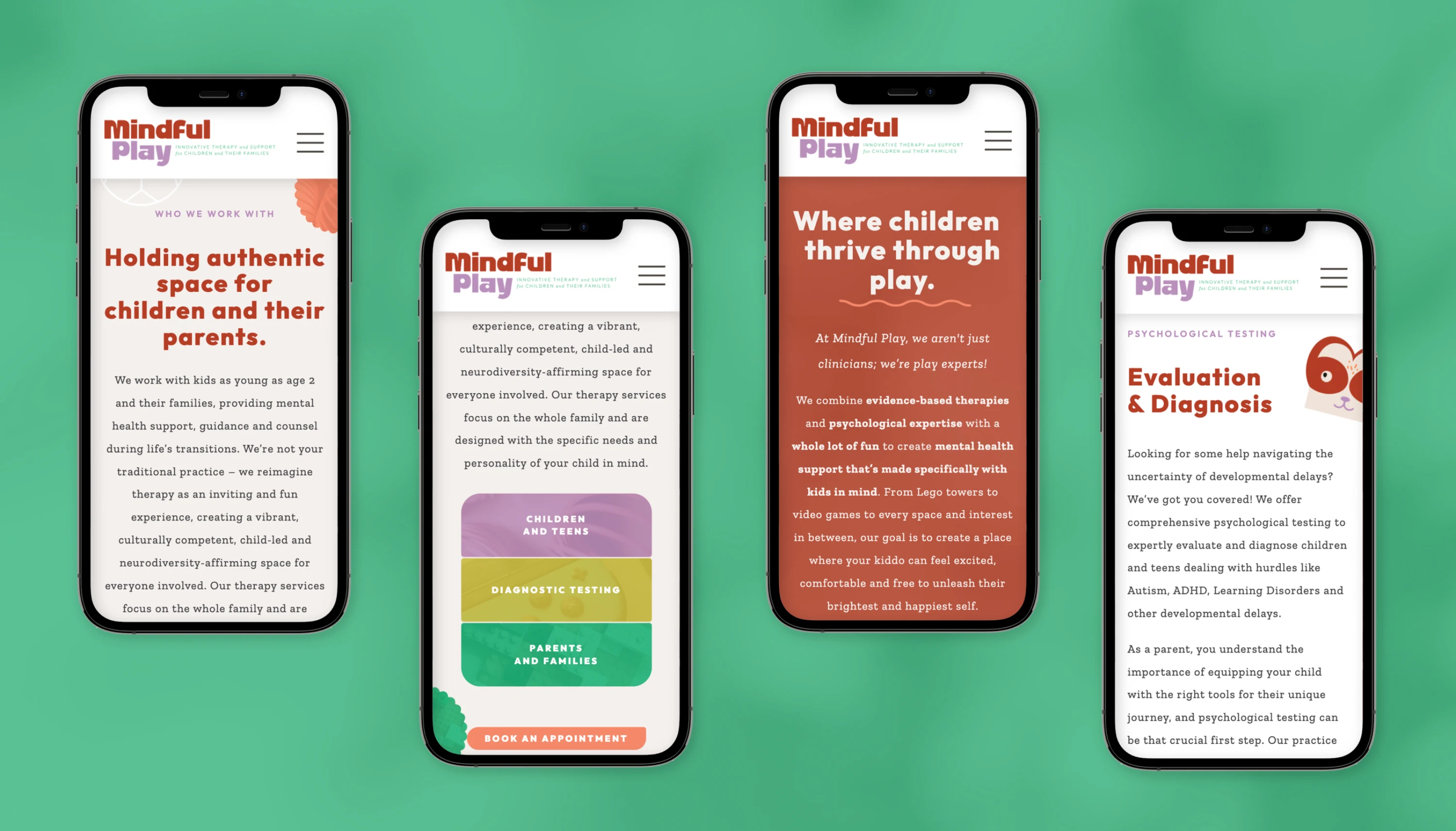
Mindful Play Psychology came to us with a clear philosophy and a team that treats play as the language children use to work through what they feel. Their clinicians combine evidence-based approaches with Lego towers, video games, art, and sand trays, and the practice serves children from age two through the teen years alongside the parents guiding them.
A practice like that is easy to flatten into the standard therapy website, with a soft palette, a stock photo of a smiling family, and a list of services. Parents comparing options would meet a clinic that looks like every other, and the joy that makes the sessions different would stay inside the room.
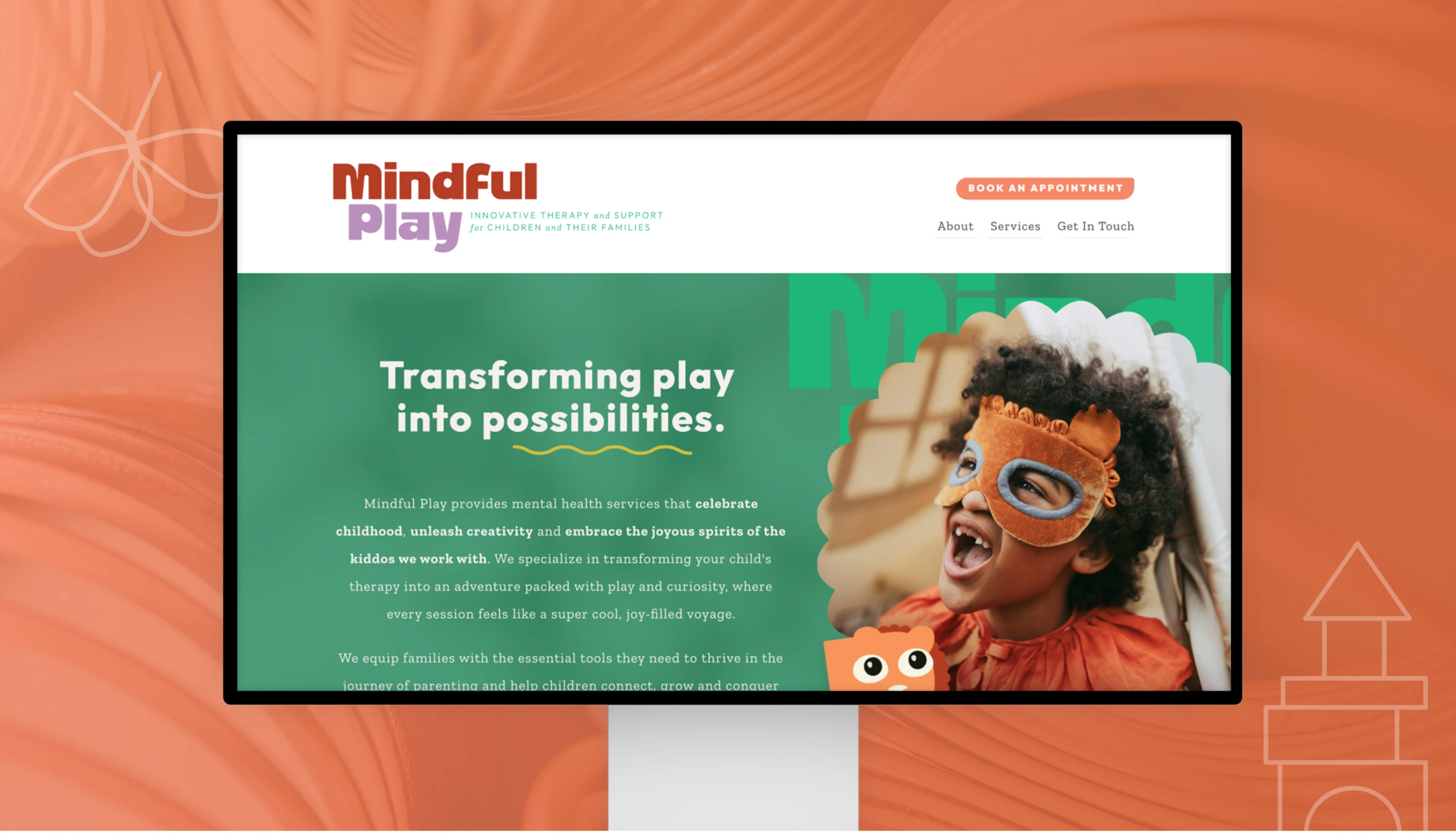
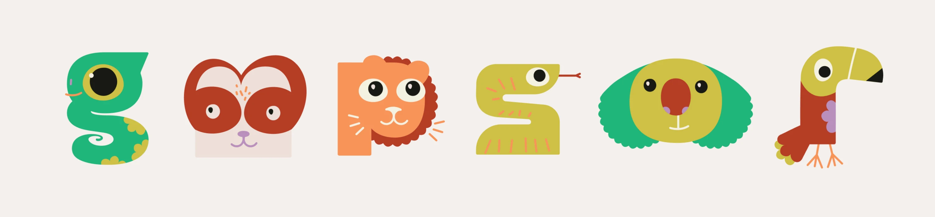
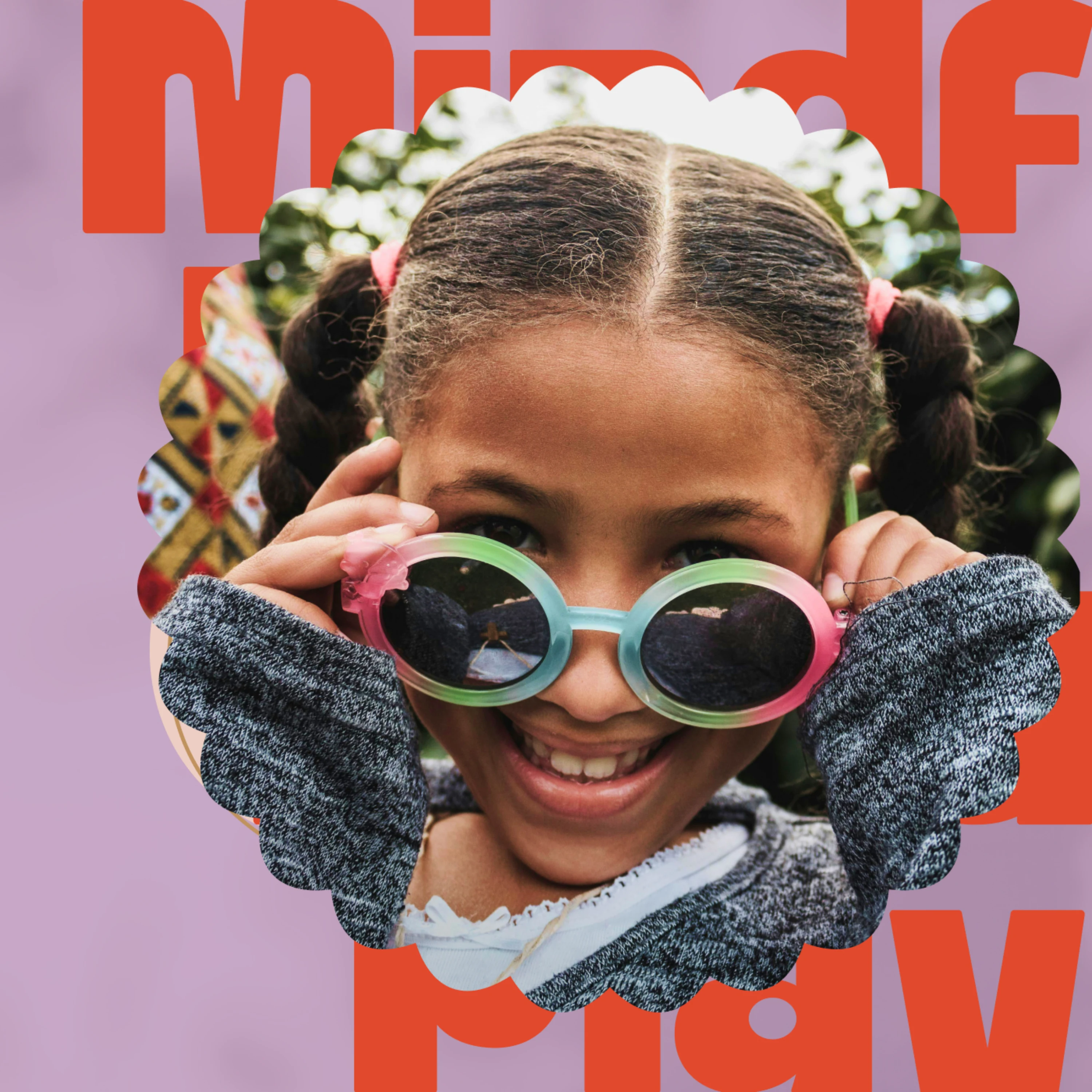
We started with the practice's own language. Phrases the team already used, such as play with purpose, child-led, and a safe and judgment-free zone, became the base of the brand language and positioning, and the visual identity and illustration grew from there in lilac, shamrock, and coral. We wrote the website copy in the same voice, so a parent reading about parent coaching hears the same warmth a child feels in the playroom.
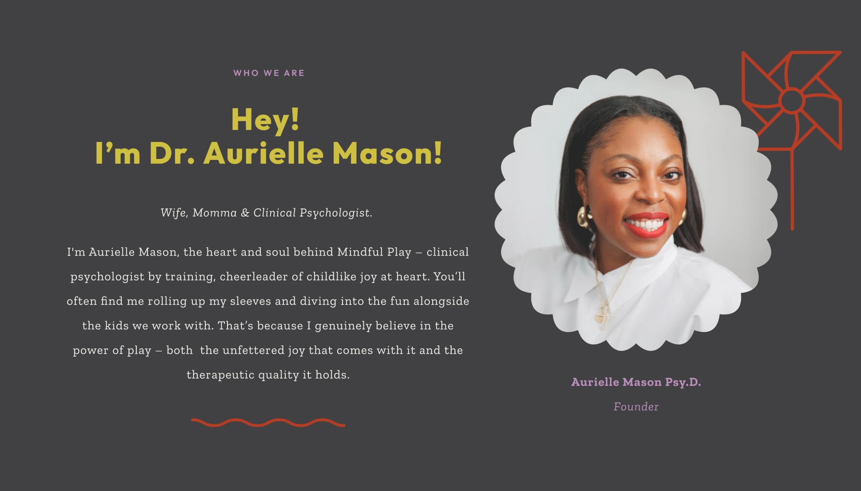
Today the website introduces child and family therapy, parent coaching, and psychological testing in a voice that sounds like the people who offer them. Families can see how the practice works, meet a team the practice describes as diverse and experienced, and understand that neurodiversity-affirming care is part of how Mindful Play works. The brand gives parents a first impression that matches the experience their child will have, and it gives the team language they can use in consults, referrals, and conversations with families.